
Navicat BI Tutorial: Chart Design and Dashboards
Navicat BI Tutorial: Chart Design and Dashboards
Jul 3, 2024 by Robert Gravelle
Business Intelligence (BI) is the practice of transforming data into actionable insights that empower organizations to streamline productivity and achieve better overall performance. This blog recently introduced the new Navicat BI, which is a tool that helps BI professionals better understand their data through the creation of data visualizations such as charts, graphs, and dashboards. Last week’s blog walked us through the process of creating a workspace and data source in Navicat BI. Today’s post will cover how to design an interactive chart and present it within a dashboard.
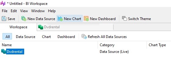
Recall that, in last week’s tutorial, we added the Dvdrental data source to our workspace. We will now use it to populate the Total Sales Percentages by Category chart.
To open the Chart Designer, click on the New Chart button in the main toolbar of the BI Workspace window:
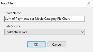
That will bring up a dialog prompt where you can enter the Chart Name as well as assign the Data Source. Having previously created the Dvdrental data source, we can now select it to populate our new chart:
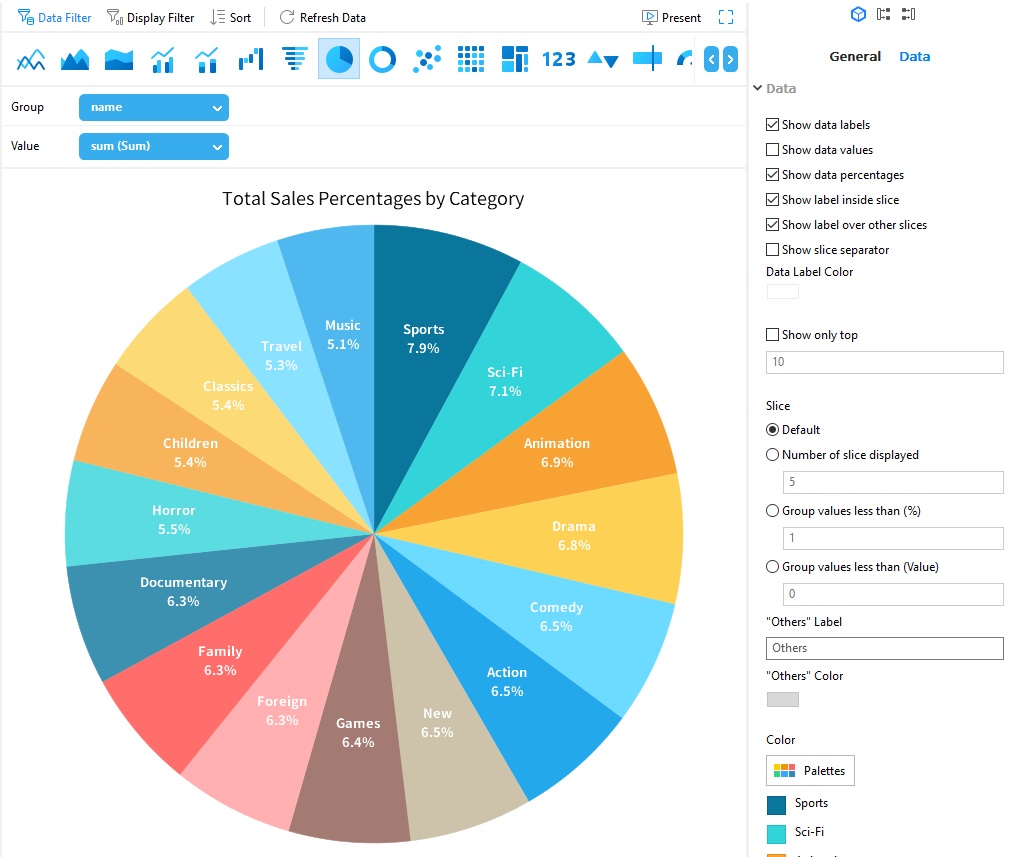
In the Chart Designer, the various chart types are located in a toolbar above the chart fields. We’ll select The Pie Chart type by clicking its icon:
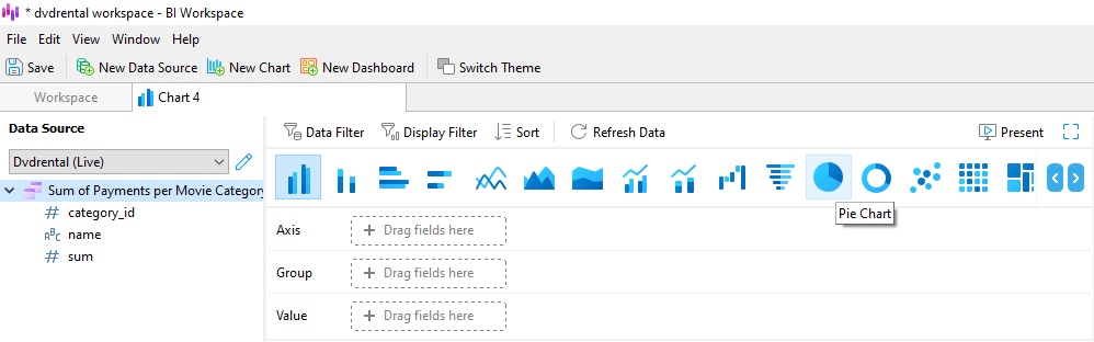
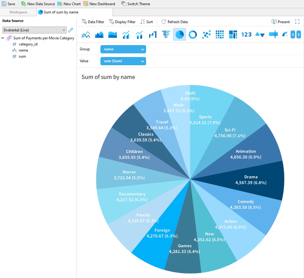
It has only two fields: the Group and Value. We can drag the fields from the data source on the left to the drop-downs. We’ll group by name and show the value of the sum field:
Customizing the Chart
There are many ways to customize a chart via the Properties Pane to the right of the chart. For instance, we can set the title as follows:
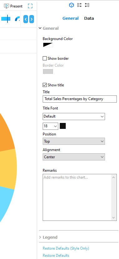
There are many other properties in the Data pane. There, we can show or hide various data/chart elements as well as change the color palette. These may be selected from a predefined color scheme, or assigned to each specific value. Here’s the chart without data values and a more colorful palette:
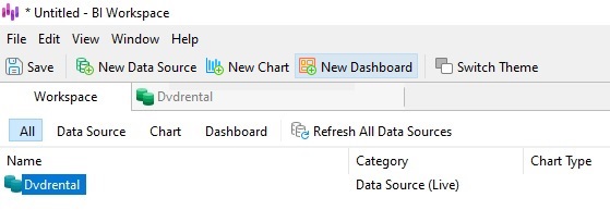
Just as we did to create a new chart, we can click the New Dashboard button to create a dashboard:
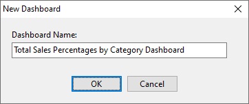
Doing so will again present a dialog prompt, where we can assign a name to our dashboard. We’ll call it “Total Sales Percentages by Category Dashboard”:
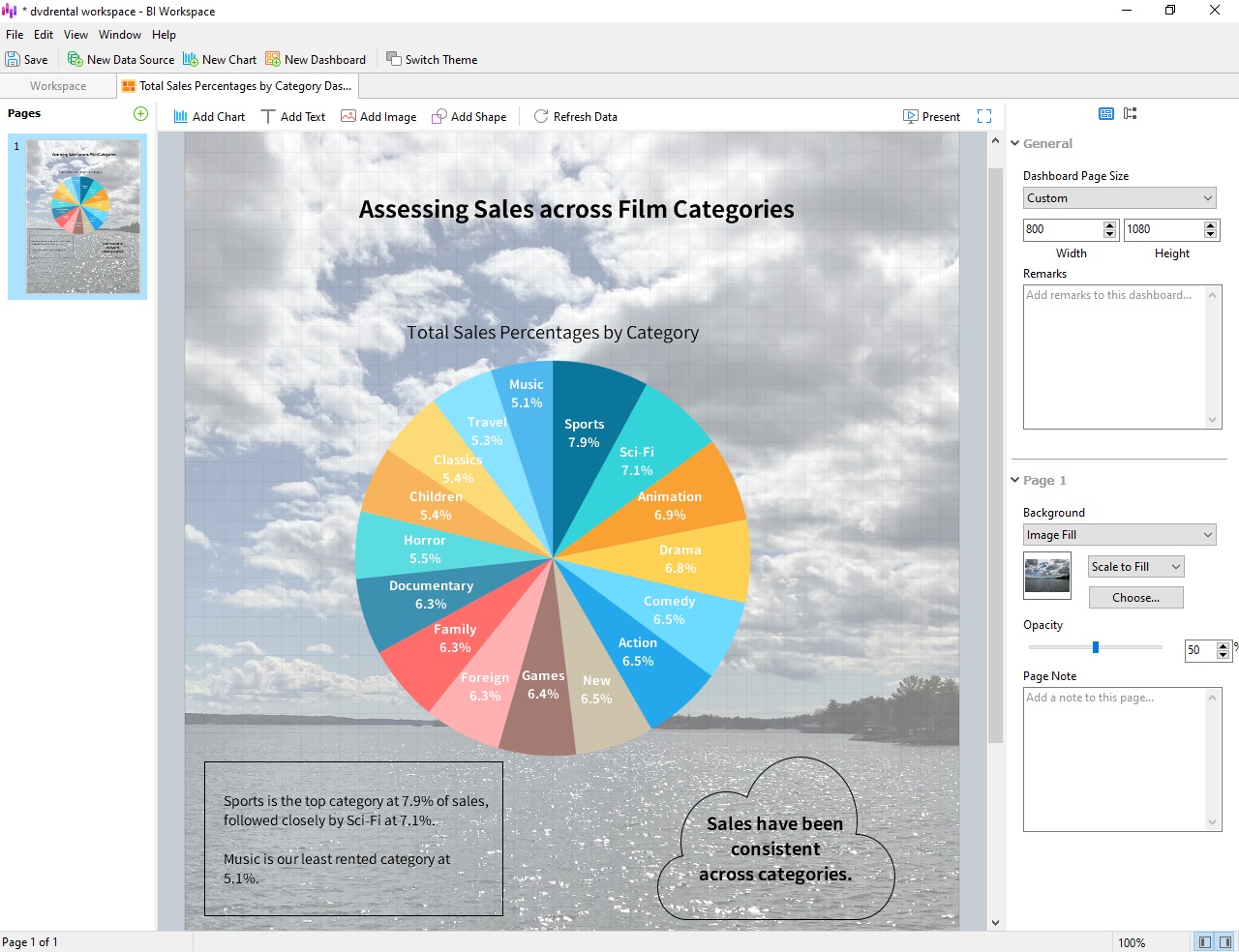
A dashboard is a place to combine multiple views of data to glean richer insights. As such, a single dashboard may contain multiple (interconnected) charts, text, images, shapes, and other elements that help gain new insights on existing data. You can even give a dashboard a background image, as seen here in our film categories dashboard:
Dashboards may be saved as external files to be shared with colleagues or presented directly from Navicat BI.
This tutorial went through the process of creating a dashboard in Navicat BI. In part 1, we added a new workspace and built the data source. In today’s blog, we learned how to design an interactive chart and present it within a dashboard.
You can download Navicat BI for a 14-day fully functional FREE trial. It’s available for Windows, macOS, and Linux operating systems.

